Another round of snow and winter are headed our way, delaying all of us from breaking dormancy….so let’s discuss some history of Midland (and its logo).
History of Midland’s and Classic Golf Course Logos –

Bradley Klein – Golf Course Historian, writer, author, journalist, political scientist, and consultant states:
“The founding individuals of Classic Golf Courses in the early 20th century were extremely thoughtful. Thoughtful of everything they did, and especially the logo that they created to represent what was unique to them, what they valued, what set them apart. Some clubs valued their unique location, plant, or animal that was local to their playing fields. Their logo captured a sense of nostalgia that you just can’t recreate if you tried. But all of these visionaries valued nothing more than the game of golf that brought them all together, to value the time playing a timeless sport. Many clubs, over time lost their way, they lost the respect for the vision, and mission of what their clubs were founded upon. Along with pushing aside the classic golf course architecture, making uncalculated changes, they often changed their logos. A large part of my consulting work directs many Committees to go back and look at what the founding members had as a vision for their club, look at who their original architect was, what their style was. Look at the founding mission of the club, and the logo that represented them. The vast majority of my clients go back to those basics to find clarity in the direction they need to go. It’s a very simple process. They don’t need to adapt, they need to go back to their roots. The most successful clubs in the world do that, and they don’t waver.”
History of University Golf Club — Midland Hills Country Club
![]()
The University Golf Club (9 holes in 1916) (now the UofM 18 hole course) was comprised only of University Professors, and Executive staff. A group of those members broke off in 1919 to form a new club, Midland Hills CC, which sought after local business professionals, and owners. It took them 3 years to come up with the name Midland Hills.
April 21, 1922 – Changing the name of the club to Midland Hills CC – Article of Incorporation

The founding members of Midland Hills deliberated every decision in great detail, as proven in the BOD minutes – choosing a golf course architect, discussing club financials, staff, accommodations, future progress and growth. They met almost weekly for 2 years straight. Unfortunately, after Ralph Barton, who was the club secretary, left to go work with Seth Raynor, the detail and quality of the club minutes diminished post 1922.
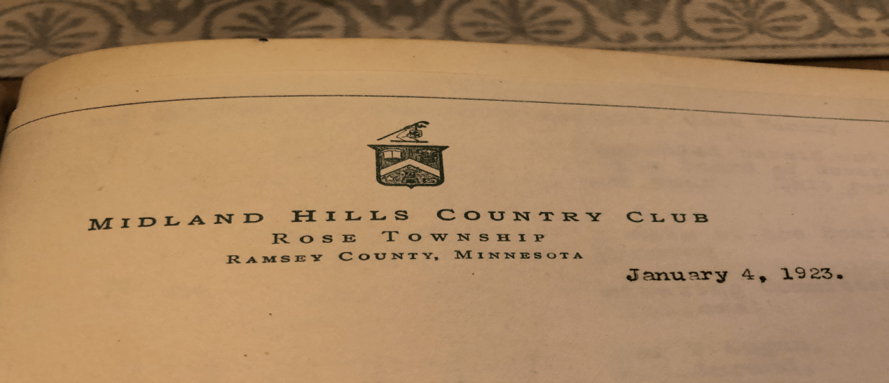
From the Midland Board of Director’s meeting 1923
Entrance to the original clubhouse at Midland

Entrance sign up close

Breaking down the University Golf Club Logo
![]()
- A book is obviously the connection to the University’s higher learning
- The North Star
- The bale of hay is the connection to the University’s Agriculture School
- The handshake is common comradery over sport
- The tower is unknown. There could be a building on campus that had a tower, potentially the Union Club, where the Midland founding members held their meetings, prior to meeting at the original farm/clubhouse
- At the very top, above all else, is the representation of playing the game of golf
We can assume that when those individuals broke off and decided to create their own club in 1919, they took the top portion of the original University logo with them. Why just the top? Because it represented what the founding members wanted to be: A true independent golf club. Same as we are today.
Breaking down the original Midland Hills Logo
![]()
- The Rampant Lion was adopted by Scotland as the royal coat of arms, and incorporated into the Great Seal of Scotland. The Universities around the US often used the rampant logo as the tradition of education. This goes back to the oldest schools known to man – Oxford, Cambridge, Edinburgh, etc. This is the connection to the University of Minnesota.
- The Mashie/Niblick/Jigger club are obviously the most commonly identified clubs of that era.
- The strong arm is symbolic of holding up something of great tradition. It’s been used in other sports such as cricket, polo, and baseball.
- Simplistic, clean, and authentic.
- Looks/feels 100 years old and nostalgic.
I think the correlation to the UofM was that they understood the traditions of the game going back to Scotland (more impressively and ironically brought to America by CB Macdonald.) Did they have this in mind when they originally wanted to hire Donald Ross, and ended up hiring Seth Raynor?
Evolution of Midland’s Logo/Font/Letterhead – The start of constant change
1935 Scorecard – Fleur de Lis stamp?

Letter 1921 by Ralph Barton. A Fleur de Lis stamp?

At some point, probably starting in the 1950’s, our logo changed like the wind changes direction, for reasons unknown
![]()
![]()
![]()
![]()
![]()
![]()
![]()
Breaking down the 1970’s Midland Hills Logo
![]()
![]()
- English Font of club’s name. Why English and not Scottish font?
- Male golfer wearing a tie and nickers, with a mustache
- Wearing an Ivy cap, which symbolizes an elitist status symbol. Ivy caps were worn by most men, dating back to the 14th century. Those who were poor wore wool caps, those of status wore cashmere and silk caps, letting others know their financial status
- Golfer is aiming away from a green
- Green is surrounded by trees, with multiple trunks. Do we have a green on the course that represents this?
- In 2015, we removed the Midland Hills Country Club, and added 1919, to make it more simplistic and clean, but it’s still not the club’s original logo
![]()
Collection of Logos from Classic Golf Course Clubs


![]()
Did you notice the trend of clean, simplistic, and authenticity? These logos represent their club’s in a unique and nostalgic way
- Shinnecock Hills
- Maidstone
- Cypress Point
- Merion
- Fishers Island – Raynor
- Yale – Raynor
- Stanwich Club
- Myopia Hunt Club
- Monterrey Peninsula CC – Raynor
- Olympic Club
- National Golf Links of America –Raynor
- Winged Foot
- Seminole
- Wianno Club
- Boston Golf Club
- Piping Rock Golf Club – Raynor
- Shoreacres – Raynor
- Fox Chapel – Raynor
- Camargo Club – Raynor
- Everglades Club – Raynor
- Creek Club – Raynor
- Sleepy Hollow – Raynor
- Oakmont CC
- WBYC
- Royal Troon
- San Francisco Golf Club
- Cal Club
- Garden City Club
- Somerset Hills CC
- Quaker Ridge Golf Club
- The Country Club
- Kittansett Club
- Sankaty Head
- Pine Valley Golf Club
- Canterbury GC
- The Golf Club
- Philly Cricket Club
- Merion Cricket Club
- Midland Hills – Raynor
As you can see, it was well documented what Midland’s original logo was. It was unfortunately not documented as why it was changed so many times, and how we came to think the “golfer” as we know it, as our logo. If you look at the history of Midland, and the history of the game of golf, our logo represented the tradition of golf, with a lineage to higher learning . We may have lost our way for a few decades with taking pride of the club’s Seth Raynor golf course, and maybe even its original logo. But we know this club was proud to be founded on the game of golf, and still is to this day. As we learn more about our history, that pride grows even more.
Mike Manthey
Golf Course Superintendent

Well done Mike! Another blog that adds to our enjoyment of membership!
Thanks for putting this together. I think the tower in the original logo is the ice palace from the St. Paul Winter Carnival.
Great fun to read-knowing our history adds to the enjoyment of being a member. Thanks Mike
Thanks, Mike.
I agree with John Hamburger that a Winter Carnival Ice Palace is a logical suspect for the tower. It seems more apt than the first suspect I could find — the Armory at the U. The specifically *University* part of the logo is pretty well taken care of the top part of the crest.
What I’m wondering about is this: Does the handshake represent not just a sportsmanship commentary, but maybe also a handshake between Minneapolis and St. Paul (as in the Twins’ Minnie and Paul)? The rivalry between the cities was very much in progress by the time of the club’s founding.
I realize this is a controversial matter, but … I wish we would bring back the entire original logo. Yes, it’s *busy* — but it says a lot … specifically about Midland Hills (whereas the golfer logo could be a logo for any golf course anywhere).
Well done Mike! Really appreciate learning more about the history of the club.
Thanks!